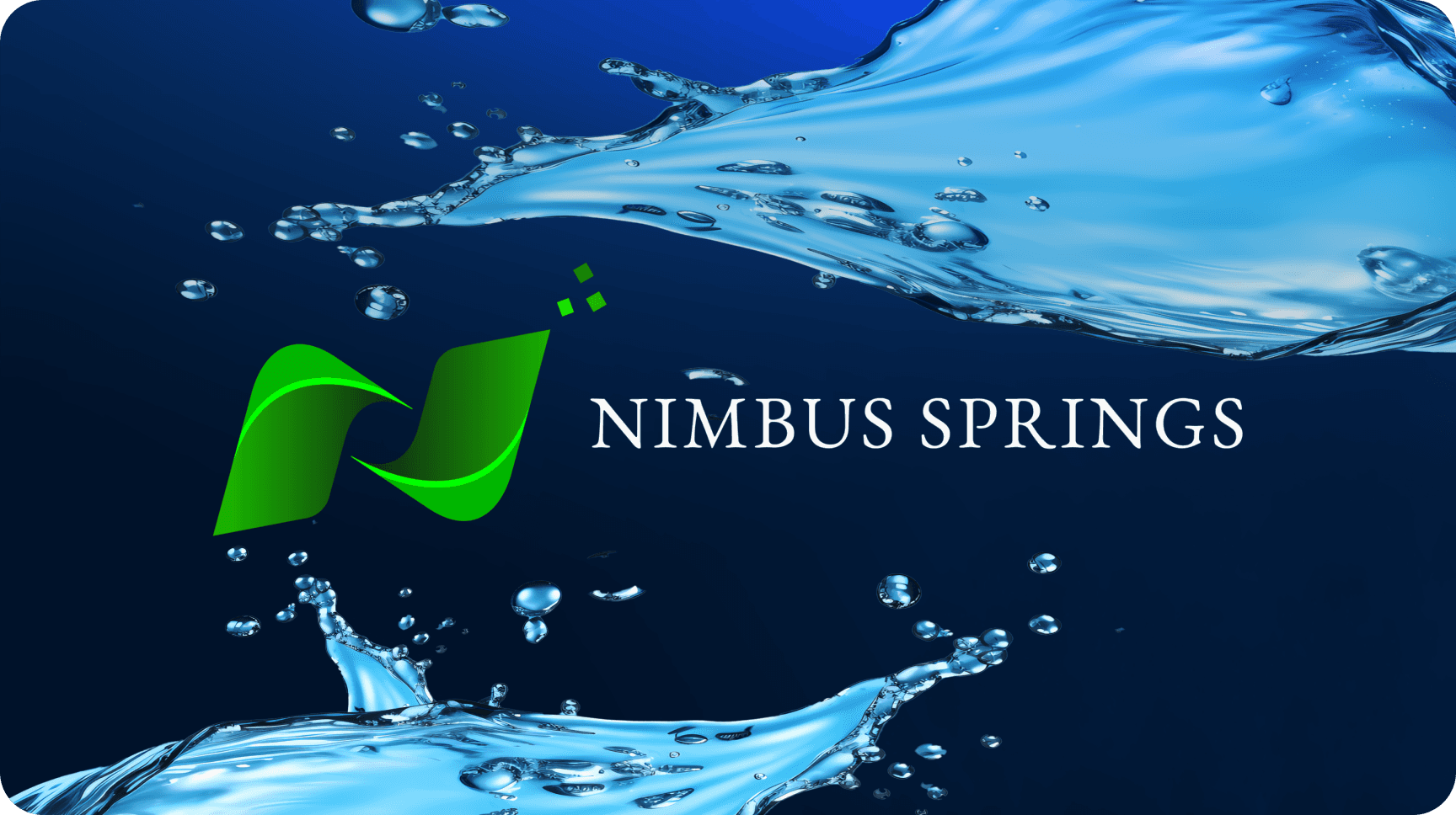
Nimbus Spring
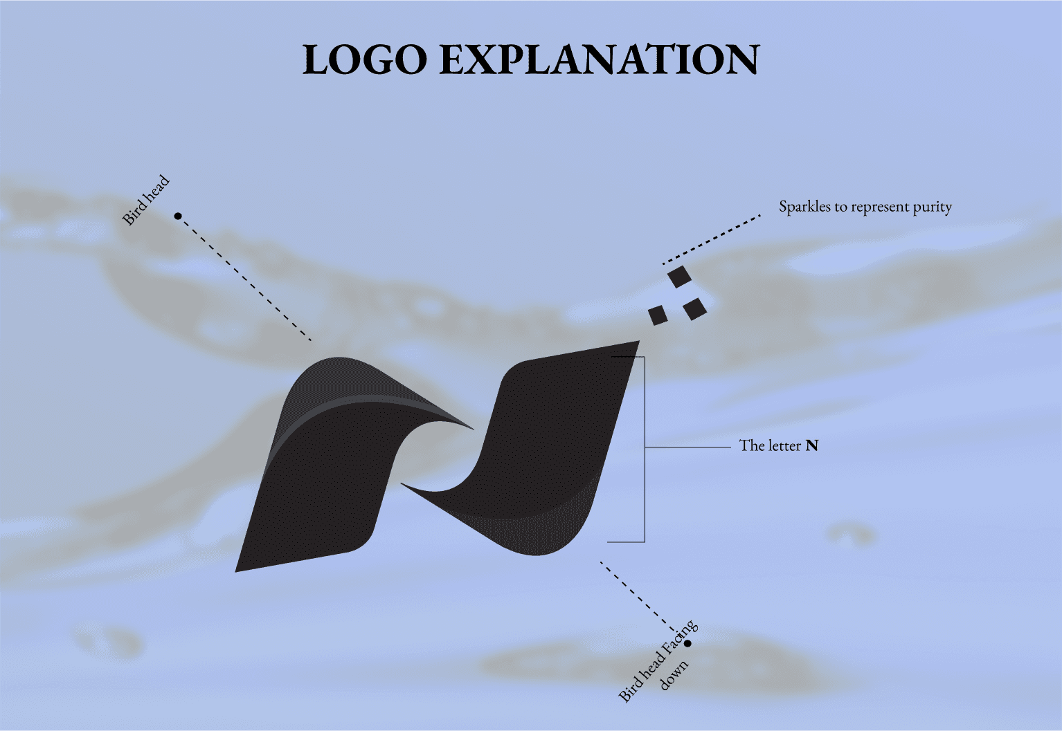
I created the Nimbus Springs brand identity as a fresh, modern look for a bottled water company. My focus was on designing a clean and memorable logo, along with a cohesive visual system that reflects purity and trust. I used tools like Figma, Illustrator, and Photoshop to develop everything from the logo to the bottle labels and supporting brand assets, making sure the brand stands out on the shelf and feels approachable to customers
Client
NIMBUS SPRING
Service Provided
Web Design
The Goal:
My goal with Nimbus Springs was to build a strong, recognizable brand identity that communicates quality and reliability. I wanted the design to appeal to a wide audience and help Nimbus Springs make a positive first impression in a competitive market
1
The Challenge:
The main challenge was creating a visual identity that feels both unique and timeless, while also being versatile enough to work across different packaging and marketing materials. I had to balance simplicity with distinctiveness, ensuring the brand would be memorable without being overcomplicated
2

The Result
The result is a polished, professional brand identity for Nimbus Springs. The design system is flexible, visually appealing, and helps position Nimbus Springs as a trustworthy choice for consumers looking for quality bottled water
3

Recent Designs